
Responsive Web Design Services for All Devices
Design That Adapts to Every Screen
Responsive design ensures your website looks and functions perfectly across all devices — desktops, tablets, and smartphones. With user behavior increasingly mobile-first, this design approach boosts engagement, reduces bounce rate, and improves SEO.
- 100% Mobile & Tablet Friendly
- Cross-Browser Compatibility
- Optimized Layout for Every Screen
- Improved User Engagement & Accessibility
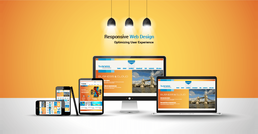
Our Modern Responsive Design Approach
Crafted with strategy, precision, and seamless experience across platforms
Fluid Grids
Scalable layouts that adjust according to screen width with consistency.
Flexible Media
Adaptive images and videos that resize intelligently to fit various screens.
Breakpoints & Queries
Custom media queries for precise control over screen behaviors and design shifts.
What’s Included in Our Responsive Design Services
UX/UI Design
Visually appealing and functional user interface designed for intuitive navigation.
Performance Optimization
Faster loading times on all devices with optimized resources and lightweight code.
Accessibility Compliance
Ensure your website is accessible to users of all abilities with WCAG compliance.
SEO Optimization
Structure and content practices that align with modern SEO requirements.

Lightning-Fast Performance on All Devices
Speed is critical for user retention and SEO. Our responsive web designs are crafted with performance in mind — ensuring rapid load times and seamless navigation whether on mobile, tablet, or desktop.
- Fast Loading Speed & Core Web Vitals
- Google Mobile-Friendly Compliant
- Reduced Bounce Rate with Smooth UX
- Optimized Media & Code for Speed
Platforms We Build Responsive Sites For
From static HTML to CMS and ecommerce — we ensure responsiveness on all tech stacks.

WordPress

HTML/CSS

Shopify

React

Bootstrap

GitHub Pages
Your Website, Seamless on Any Device
Make a lasting first impression. Let’s design a fully responsive site tailored to your business needs.
Get a Free Responsive Demo